

Custom Custom Toper сав баглаа боодол
Custom Cigarette Packaging Boxes: Design, Functionality, and Branding Custom cigarette packaging boxes play a crucial role in the tobacco industry, serving as both a protective container and a powerful branding tool. These boxes are designed to meet specific requirements, ensuring product safety, compliance with regulations, and effective marketing. 1. Design and Customization Custom cigarette boxes are tailored to reflect a brand’s identity through unique designs, colors, logos, and typography. High-quality printing techniques, such as offset, digital, or foil stamping, enhance visual appeal. Brands can choose from various finishes—matte, gloss, or soft-touch—to create a premium look. Additionally, embossing, debossing, or spot UV coatings add texture and sophistication. The shape and size of the packaging can also be customized. Standard flip-top boxes, slide-and-shell packs, or innovative structural designs help brands stand out. Window cutouts or transparent panels may be incorporated to showcase the product inside. 2. Material and Durability Cigarette packaging must protect the product from moisture, light, and physical damage. Most boxes are made from rigid cardboard or paperboard, often lined with foil or moisture-resistant coatings to preserve freshness. Eco-friendly materials, such as recycled paper or biodegradable laminates, are increasingly popular due to environmental concerns. 3. Compliance and Safety Tobacco packaging is heavily regulated in many countries. Custom boxes must include mandatory health warnings, ingredient lists, and tax stamps. Child-resistant closures or tamper-evident features may also be required. Manufacturers must ensure that designs comply with local laws while maintaining brand aesthetics. 4. Branding and Consumer Appeal Packaging is a key factor in attracting customers. A well-designed box communicates brand values, whether luxury, affordability, or innovation. Limited-edition designs or seasonal variations can create excitement and encourage purchases. Some brands use minimalist designs to comply with plain packaging laws, while others leverage bold graphics to differentiate themselves in competitive markets. 5. Sustainability and Innovation As environmental awareness grows, brands are adopting sustainable packaging solutions. Recyclable materials, soy-based inks, and reduced plastic usage align with consumer preferences. Smart packaging, such as QR codes for authentication or interactive elements, enhances user engagement. Conclusion Custom cigarette packaging boxes are more than just containers—they are essential for brand recognition, regulatory compliance, and consumer satisfaction. By combining innovative design, durable materials, and adherence to legal standards, manufacturers can create packaging that protects the product while reinforcing brand identity in a competitive market.
бүтээгдэхүүн
Ангилал:
-
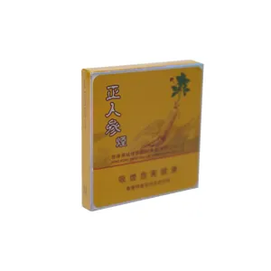
Zheng ren shen yan брэндийн тамхины сав
ангилал: Тамбарги хайрцагҮзсэн тоо: 804серийн дугаар:суллах хугацаа: 2025-09-27 09:30:01Энэ тамхины багцын загвар нь уламжлалт гоо сайхны зураглалыг байгалийн гарал үүсэлтэйгээр харьцуулж, шууд харааны нөлөөллийг бий болгодог. Нийт палитр нь анхдагч, анхдагч алтан шар өнгөтэй байдаг. Энэ сүүдэр нь тод нимбэгний шар өнгө биш харин намрын будааны иш, торгон торгон даавуу, жижигхэн шөрмөсний даавуу, салхины махны өнгө, түншлэгийн даавуу, салхины уламжлал, сонгодог түншийн даавуу юм. Хамгийн гайхамшигтай гар урчууд нь торгон дэлгэцийн цасан ширхэгтэй цасан ширхэгтэй цацраг идэвхждэг. Энэ техник нь энгийн өнгөний давхцалаас давж гардаг; мэргэшсэн бэх, хэвлэх аргуудаар дамжуулан, энэ нь шар ёроолгүй өвлийн хүйтэн жавар эсвэл эмзэг элсний үр тариа дээр хэт нарийн бүтэцтэй байдаг. Энэ нь анхдагч монохромат шар өнгийн гадаргууг баян бүтэцтэй зурагт хувирдаг. Нарийхан мөхлөгт мэдрэмжийг мэдрэгчтэй мэдрэгддэг, нүдэнд харагдах байдал, нүдэнд зөөлөн манангаар халхалдаг мэт харагдаж байна. Энэ нь сав баглаа боодлын нарийн төвөгтэй, уян хатан туршлагаас зайлсхийх, хавтгай монотон, онцгой гар урлал Хайрцагны ирмэгийн дагуу, дизайнерууд нь нүд гялбам, цайралттай хил. Энэхүү гэрэлтүүлэгч обуд нь хатуу өнгөний тууз биш, харин навигаци эсвэл бүрсэн техникийг ашиглан солонго хэлбэртэй эсвэл эхийнх нь үр нөлөө үзүүлдэг. Үзэх өнцгийн өнцгийн өөрчлөлтийн хувьд хилийн гради, алтан ногоон, алтан ногоон өнгөтэй, Энэхүү гэрэлтүүлэгч нарийн ширхэгтэй уламжлалт шаргал өнгөтэй холбоотой ямар ч цочролыг өдөөдөггүй, уламжлал, орчин үеийн хэв маягаар, өндгөвч, орчин үеийн хэв маягаар рустик дизайныг хэрэгжүүлдэг. Хайрцаг дээрх төв сэдэл нь гоёмсог үзүүлсэн ургамлын хэв маягийг бий болгодог. Бодит ба илэрхийлэлтэй арга техникийг ажиллуулах, дизайн нь гинцентийн үндэс суурийг нэн даруй олж авах нь GINSENG-ийн PLUP-ийн үндсийг нэн даруй олж авав. Энэхүү "Ginseng" нь тод, хавтгай өнгөөр ялгагдаагүй боловч гоёмсог монохроматик аялгуу эсвэл гогцоотой, гүнзгийрүүлсэн градиент-гэгэнд нь хатуу хэвлэнэ. Энэхүү дизайны элемент нь байгалийн гаралтай эмгэг, эрүүл мэндийн шинж чанаруудыг үл тоомсорлож, хэрэглэгчидтэй харьцуулахад хэрэглэгддэг. Ерөнхийдөө, сав баглаа боодлын хэл дээрх дизайны хэл нь нэгтгэгдсэн, эв нэгдэлтэй байдаг. Уламжлалт шар өнгийн Hue ба Ginseng Motif, мөн чанар, тэжээлийг бэлэгддэг бөгөөд байгалиас заяасан, брэндийн брэндийн зохиолыг байгальд бэлгэддэг. Торгоны дэлгэцийн цасан ширхгийг торгон цасан ширхэгтэй хэвлэнэ. Энэ нь зөвхөн уламжлал, дулаан, байгалийн мэдрэмжийг илэрхийлдэггүй, мөн байгалийн гар урлалын дэлгэрэнгүй мэдээлэл, мөн тансаг гар урлалын дэлгэрэнгүй мэдээлэл, хэрэглэгчдэд зориулсан брэндийн төлөө брэндийн төлөө брэндийн амлалт, хүндэтгэлтэйгээр брэндийн амлалт өгөхийг зөвшөөрдөг. Энэхүү сав баглаа боодлын загвар нь соёлын гүнийг харааны давж заалдахыг амжилттай хослуулсан. -
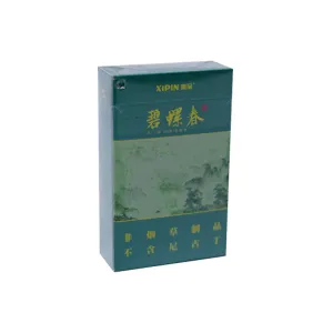
Xi PIN брэнд Biluochun сав баглаа боодлын хайрцаг
ангилал: Тамбарги хайрцагҮзсэн тоо: 775серийн дугаар:суллах хугацаа: 2025-09-27 10:33:47Энэхүү "xipin" biluochun цайны сав баглаа боодол нь байгалийн зураглал, орчин үеийн гар урлалын бүтээл, орчин үеийн гар урлалын бүтээл юм. Энэ нь зөвхөн контейнер биш, гэхдээ цай уухаас өмнө цай уухаас өмнө цай уухаас өмнө цай уудагныхаа сүнснүүдийг харагддаг. Багцын давамгайлсан давамгайлсан hue нь шинэхэн, нарийн ногоон өнгөтэй, сэтгэлгээтэй найрсаг байдал юм. Энэ нь Suppant Emerald Emerald-ийг Suppy Tent Guilds-ийг сүүдэрт ойртуулж, борооны үеэр уулархаг бардаммон дээр гялалзсан ногоон өнгөтэй байдаг. Энэ ногоон нь тайван байдал, эрч хүч, эрч хүч, амьдрах хүч, мөн амьдралын хүч, Энэ нь Biluochun цайны цайны онцлог шинж чанаруудыг төгс болгодог. Энэхүү онцгой бүтэцтэй түлхүүр нь торгон дэлгэцтэй цасан ширхэгтэй цасан ширхэгтэй байдаг. Энэ техник нь энгийн өнгөний програмаас давж гардаг. Мэргэшсэн бэх, технологийг ашиглан шинэ өвлийн цас эсвэл өглөөний хүйтэн жавартай ногоон байгууламж дээр маш нарийн цагаан бүтэцтэй байдаг. Энэ нь анхдагч ногоон гадаргууг харааны гүнзгий хар өнгийн гүнзгий, өвөрмөц онцлог шинж чанартай болгодог. Зөөлөн мэдрэгч нь нарийн ширхэгтэй мөхлөгт байдлыг илтгэдэг, цай уух нь fuzz эсвэл dew-үнссэн өглөөний навчийг өдөөдөг. Энэ нь онцгой гар урлалыг харуулж байх үед параграфын нарийн, интерактив хэллэгийг нягталж, интерактив хэллэгийг сайжруулж, онцгой гар урлал. Хайрцагны төвд, ландшафтын хэв маяг нь гүнзгий уран сайхны үзэл баримтлалыг өдөөдөг. Нөхцөлийг боловсронгуй болгосон: Алслагдсан уулс нь манантай, толбо шиг зөөлөн, яруу найраг шиг харагдаж байна. Чухал мод нь налууг тодруулж, эрч хүчтэй эрч хүчийг дамжуулахын тулд ногоон өнгөөр чимэглэсэн. Энэ дүр зураг нь зүгээр л хуулбарыг давж гардаг; Энэ нь Билуочуны цэцэрлэгийн цэцэрлэгт хүрээлэнгийн маягийн цайны орчинг нууранд байрладаг. Энэхүү motif нь сав баглаа боодол нь соёлын соёлын резонансын, гоо зүйн гүнийг гүнзгий газарзүйн таних, соёлын үнэ цэнэтэйгээр илэрхийлдэг. Нийт дизайны ерөнхий хэл нь эв найртай нэгдэл, шинэхэн ногоон өнгөтэй, ландшафт дүрсийг бэлгэдэлтэй газар, итгэмжлэгдсэн газрын зураглал нь байгалиас заяасан газартай танилцах газрыг агуулсан байдаг. Торгоны дэлгэцийн цасан ширхэгтэй цасан бүрхүүлээр дамжуулан хүрсэн дээд зэргийн туршлагад хүрсэн туршлага нь орчин үеийн гоо зүйн мэдрэмжийг уламжлалт сэтгэл татам байдалд хүргэдэг. Энэ нь зөвхөн байгалиас сэргээгдэж, гоёмсог харааны сэтгэгдэл төрүүлдэггүй, гэхдээ тансаг мэдээллээр дамжуулан цайзын гүнзгий ойлголтыг дамжуулж өгдөг. Энэхүү сав баглаа боодлын загвар нь бүтээгдэхүүний шинж чанар, бүс нутгийн ландшафт, бүс нутгийн үзэсгэлэнт газрыг амжилттай нэгтгэдэг. -

Буддагийн гэрэл нь тамхины сав баглаа боодол дахин гарч ирэв
ангилал: Тамбарги хайрцагҮзсэн тоо: 821серийн дугаар:суллах хугацаа: 2025-09-27 17:27:21"Буддагийн гэрлийн дүрэлзсэн хайрцаг нь" Буддагийн гэрлийн гажиг, урлагийн байдал, уран сайхны илэрхийлэл, гүн гүнзгий гүнзгий философийн утгатай юм. Энгийн арилжааны контейнер байхаас хол, энэ нь өндөр сэтгэлгээ, итгэл үнэмшилтэй байхаар бүтээгдсэн хөлөг онгоц юм. Хамгийн бага боловч хүчирхэг өнгөөр ялгаж, уран зөгнөлийн тодосгогч, мөн бэлгэдлийн хэв маягаар, энэ нь оюун ухааны хэмжигдэхүүн, материалыг нэн даруй тайвшруулдаг. Сав баглаа боодол нь сонгодог тэгш өнцөгт хэлбэрийг цэвэр шугам, хурц ирмэгээр өргөжүүлдэг. Энэ геометрийн хувьд хамгийн гоёл чимэглэлийн загвар, бүх чимэглэлийг судалж, тогтвортой байдал, байнгын, итгэл үнэмшил, хүндэтгэлтэй, хүндэтгэлтэй, хүндэтгэлтэй, хүндэтгэлтэй хандах. Давамгайлсан цэвэр хар хар өнгө нь дизайны сэтгэлээр үйлчилдэг. Энэ хар бол гүн гүнзгий, бүх гэрлийг шингээдэг ёроолгүй харанхуй юм. Энэ нь анхдагч эмх замбараагүй байдал, космосыг бэлгэдэл бөгөөд энэ нь дунд зэргийн бөгөөд харанхуй, муухай байдлыг илэрхийлдэг. Шашны хүрээнд хар, хар арьстнууд, даруухан, дарамт, транскендент ба өөр нэг трансцендент, Энэ нь бүх сав баглаа боодол нь пото пормал аураг, бат бөх, хязгаарлагдмал аура-г ухамсарлаж, Энэ гүн гүнзгий харанхуй арын эсрэг, хамгийн гайхалтай, сэтгэл хөдөлгөм, сэтгэлийн хөөрөл нь урд талын дөрвөн алтан тэмдэгтүүдийн босоо чиглэл юм. Уран зургийн фонт нь эртний бөгөөд эрч хүчтэй, эрч хүчтэй, түүний цэргүүд нь сийлбэр, шингэний хүчийг агуулдаг. Тэмдэгт бүрийг зөвхөн хэвлэгддэггүй, гэхдээ харанхуйгаас болж, харанхуйгаас гарч буй харанхуйгаас гарч ирэв. Босоо байрлал нь хятадын уламжлалт чанартай, зүүн тийш, баруун тийш чиглүүлдэг. Эдгээр дөрвөн тэмдэгт нь зөвхөн гарчиг биш харин Гранд тунхаглал: мэргэн ухаан, өрөвдөх сэтгэлийн харанхуйг дахин гэрэлтүүлэхийн тулд дэлхийгээр дэлхийгээр дамжуулан дэлхийгээр дамжуулж байна гэж найдаж байна. Бүх алтан элементүүдийг халуун тугалган тамга тэмдгээр гүйцэтгэдэг. Энэхүү эртний гар урлал, орчин үеийн технологиор хайлж, орчин үеийн технологид дулааны гадаргуу дээр цацрагийн гадаргуу дээр цацраг тугалган цаас. Гүн хар арын эсрэг алтан нь алтан нь гялалзсан харцыг хараагүй харцаар хараагүй байна. Эртний үеэс хойш алтан нь нандин ариун, мөнхийн, мөнхийн, дээд. Хар холболт нь хар өнгөтэй "Тогтворгүй байдал" ба "RESTFATION" ба "RESTATHERSHING", "REXTINESTACH", "МЭДЭЭЛЛИЙН", "МЭДЭЭЛЭЛ", "МЭДЭЭЛЭЛ", "МЭДЭЭЛЭЛ", "МЭДЭЭЛЭЛ", "" МЭДЭЭЛЛИЙН "," МЭДЭЭЛЭЛ "," МЭДЭЭЛЭЛ ", Хайрцагны зүүн тал нь динамик, хийсвэр алтан хэв маягтай байдаг. Энэ нь бүх зовлон зүдүүрийг ялгаруулж, аз жаргал, бурханлаг, транскендент, транскендентийг төлөөлж буй мэргэн, транскендентийг илэрхийлдэг мэргэн үгсийг нэрлэдэг. Энэхүү хийсвэр эмчилгээ нь тодорхой зураглалын хязгаарлалтаас зайлсхийх, үзэгчид илүү их төсөөлөлтэй орон зайг хязгаарладаг. Энэ нь ёслолын сав баглаа боодол нь etertible саваа, соёлтой, соёлын резональ, Буддистуудын сургааль, соёлын резональ нь хатуу диамма биш юм. Хайрцаг нь алт тугалган тамгатай текст эсвэл брэндийн зүлэг, брэндийн мессежийг бүрдүүлэх. Хураангуй, "Буддагийн гэрлийн чимэглэл" нь хар, алтан өнгөөр будгийн тодосгогч, Энэ нь зөвхөн харааны ёслол, нууцлаг, гүн гүнзгий нөлөө үзүүлдэг бөгөөд энэ нь бүх нарийн ширийн урлал, мөн нарийн ширийн гар урлалаар дамжуулж, хэрэглэгчийн дотор хүндэтгэлийн мэдрэмжийг өдөөдөг. Энэ нь "Буддагийн гэрлийн гэрлийн" сэдэвчилсэн гүнзгий гүнзгий сэрэл, гэр бүлийн гүнзгий сэрэл, дүр төрхийг тайлбарлаж өгдөг.


мэдээ
Ангилал:
Одоогоор хайлтын үр дүн алга!
тохиолдол
Ангилал:
Одоогоор хайлтын үр дүн алга!
видео
Ангилал:
Одоогоор хайлтын үр дүн алга!
татаж авах
Ангилал:
Одоогоор хайлтын үр дүн алга!
ажилд авах
Ангилал:
Одоогоор хайлтын үр дүн алга!
Санал болгож буй бүтээгдэхүүнүүд
Одоогоор хайлтын үр дүн алга!


 Утас
Утас